
PORTER FLIGHT STATUS
Porter’s second most popular flow had a clarity issue
Role :
UI/UX Designer
Tools :
Figma, Adobe Illustrator, AI (Figma Make)
Duration:
3 Months
Problem
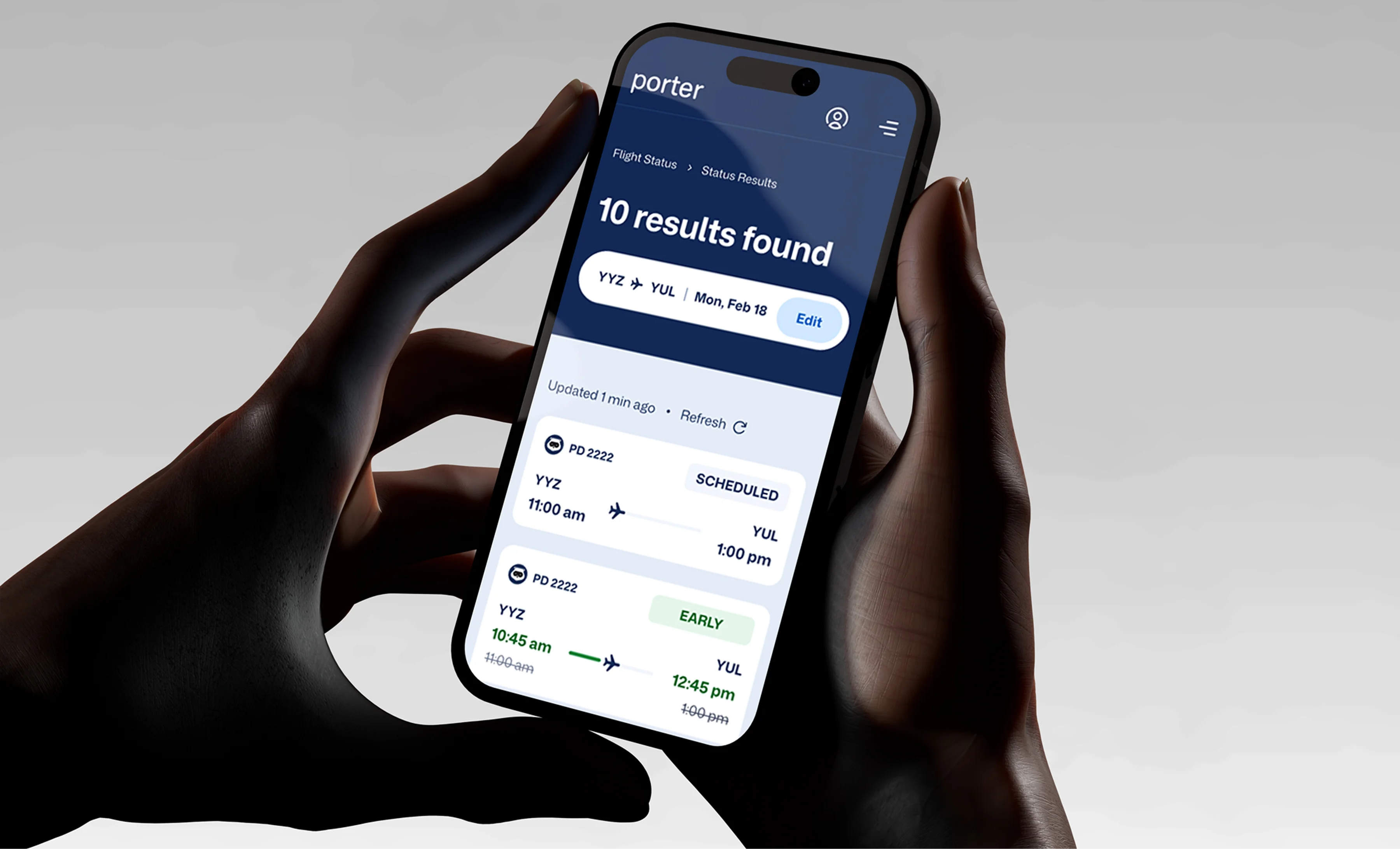
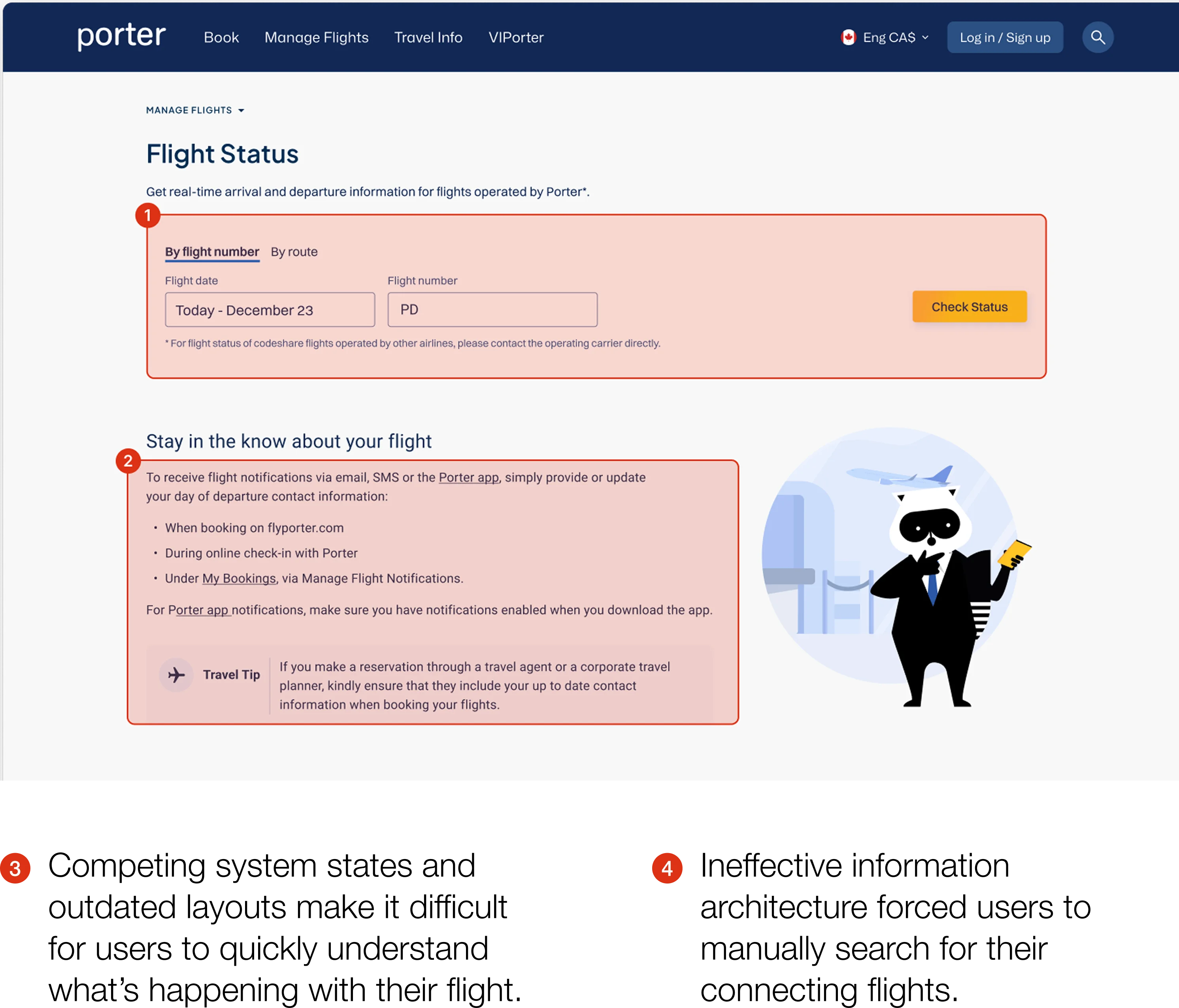
Flight Status is one of Porter’s most visited features, receiving 1.25 million visits per month, second only to booking. However, the page wasn’t designed for the real context in which passengers use it: stressful, on-the-go moments while traveling. Gate agents revealed that passengers often struggled to find key information during these situations. Most users came looking for a single, clear answer, but the previous layout forced them to search for it, while also overlooking critical operational states such as diverted flights.
Solution
I redesigned the experience to prioritize clarity and comprehensive coverage. The new solution was built using a design system I developed in parallel, ensuring consistency and scalability. The redesign was then validated through user testing to confirm it effectively addressed passenger needs in high-stress, time-sensitive scenarios.
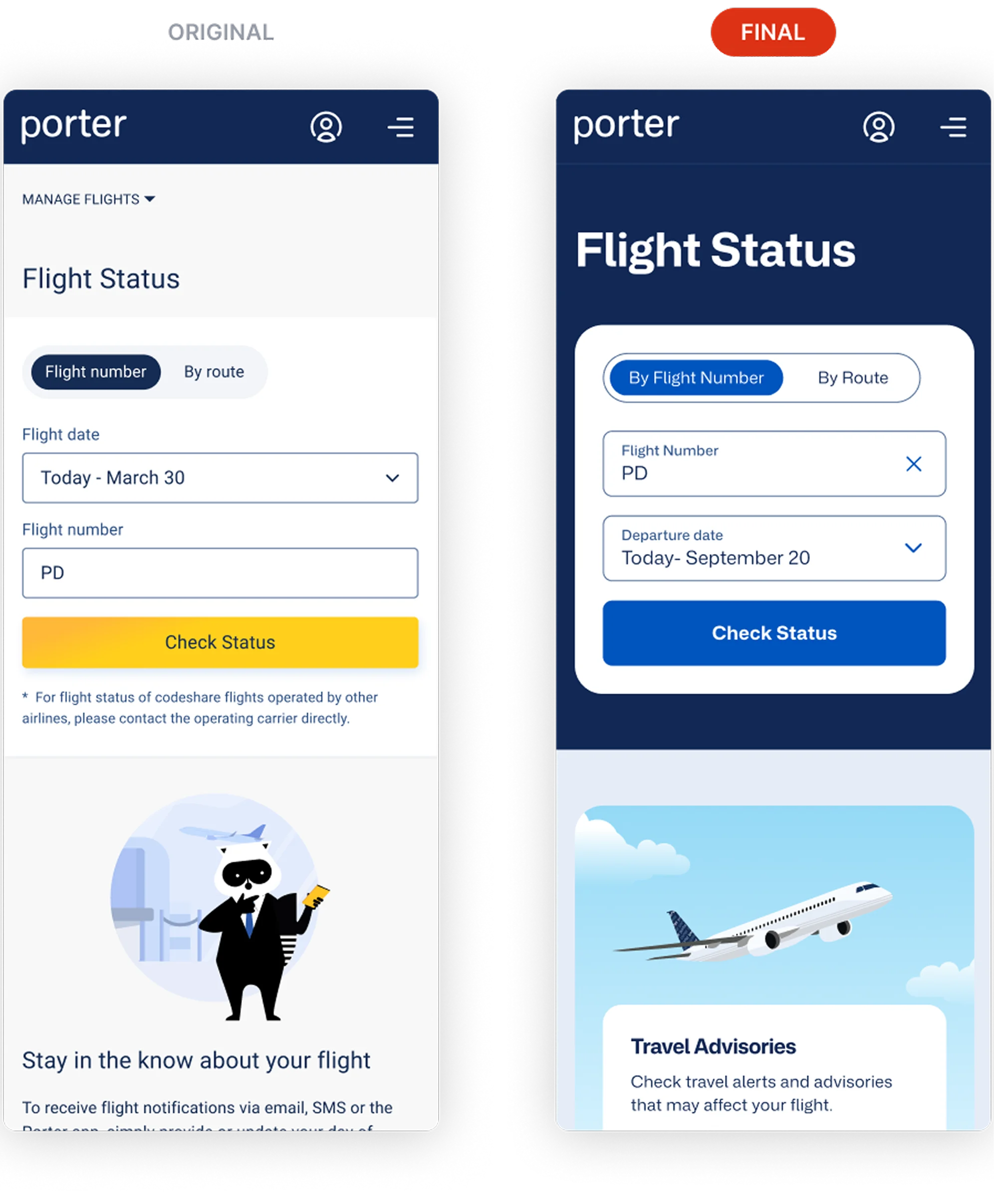
Old Main page
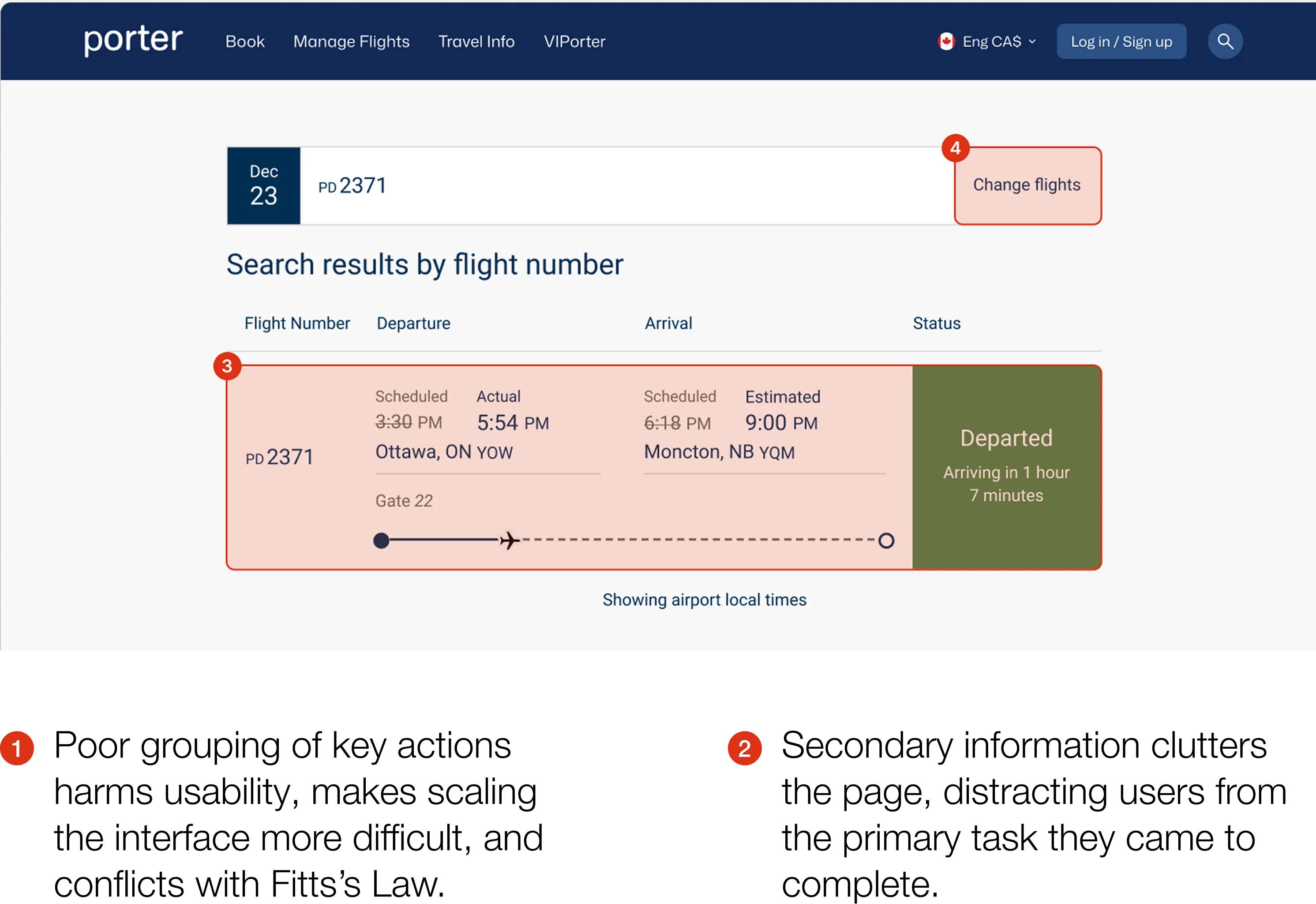
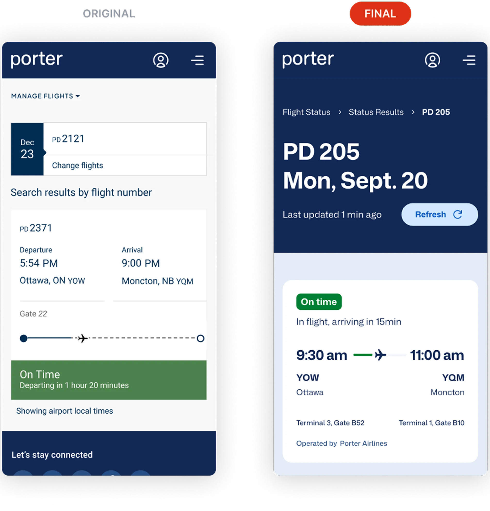
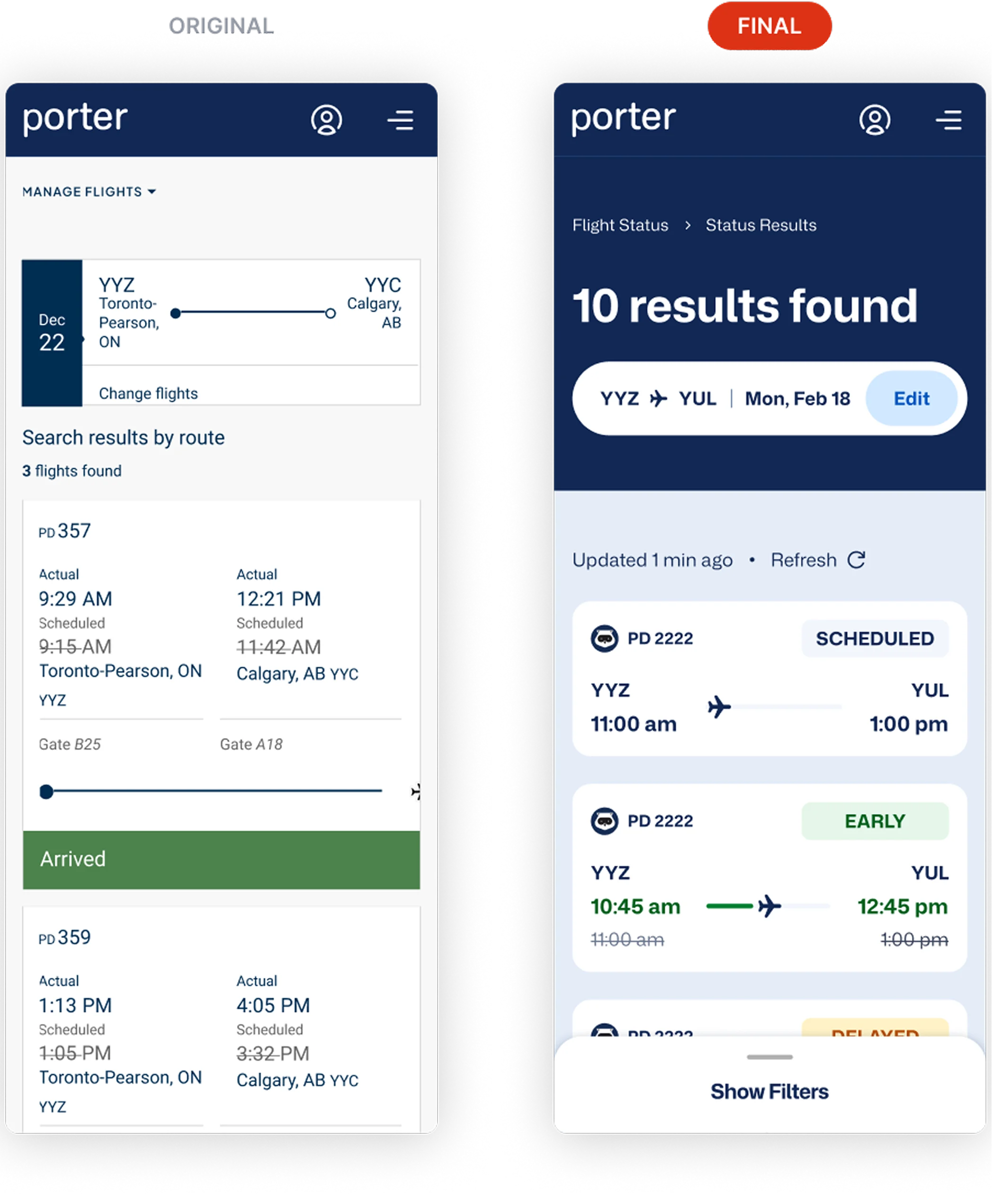
Old Result page
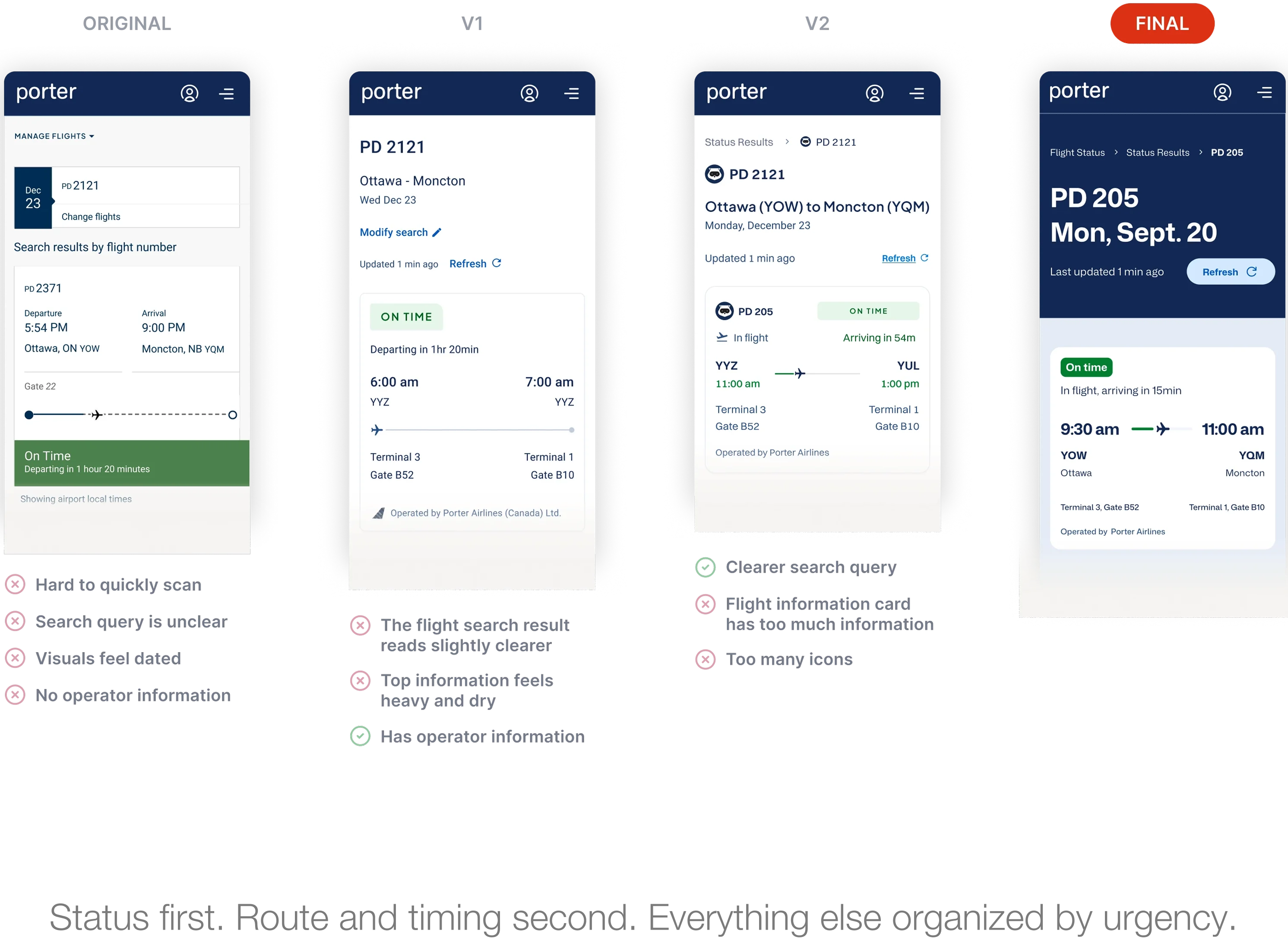
Status before everything else
Passengers access this page between gates, during connections, or when travel plans change, looking for one immediate answer: What’s happening with my flight? Usability testing revealed that users struggled to find this information quickly and confidently. Solving this required two key decisions: designing a layout that prioritizes flight status above everything else, and expanding coverage to support every operational scenario including diverted flights, which the original experience did not account for. The redesign focused on giving passengers timely, clear information when they need it most, while aligning with Canada’s passenger protection regulations that require airlines to keep travelers informed during delays and cancellations.
Don't make users search for connections
Mid-project, a backend constraint surfaced: the system couldn’t determine whether a passenger was continuing to a connecting flight or ending their journey at a layover. To address this limitation, I placed the next flight leg directly beneath the primary status result, making it visible for every user. This removed the need for passengers to manually search for connecting flight details and created a more seamless experience regardless of their travel path.
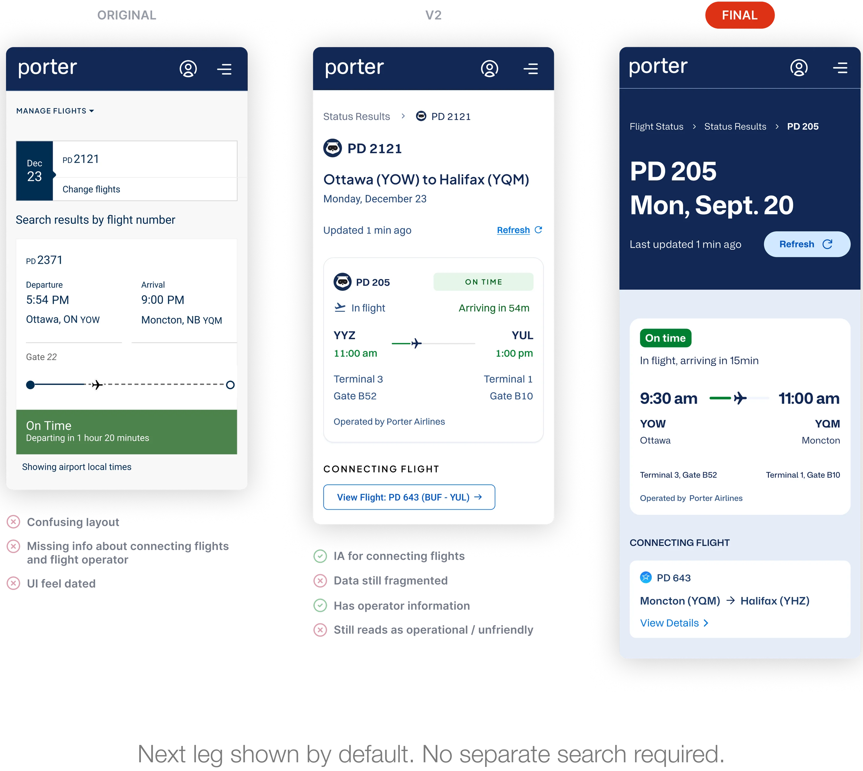
Dark blue anchors the primary view
I used Porter’s deep brand blue to create a clear visual hierarchy between the primary action and supporting details, helping stressed passengers immediately understand what to do next. During usability testing, users were able to locate key actions on their first attempt without unnecessary scanning or backtracking, confirming that the new hierarchy improved clarity and efficiency.
Landing Page
Results by Flight Number
Results by Route
Added aircraft info as a moment of delight
I advocated for adding aircraft details and onboard service information as a small preview of the journey ahead. Our CX Director questioned whether the content was truly relevant, so I framed the decision around three potential benefits: helping passengers recognize their aircraft, building anticipation, and creating moments of delight. Rather than relying on assumptions, I proposed validating the feature through usability testing by observing whether passengers noticed and valued the section. The results were clear—users referenced it unprompted, with one participant saying, “Oh, this section is really fun, I love it.” Based on the positive response, we kept the feature in the final experience.
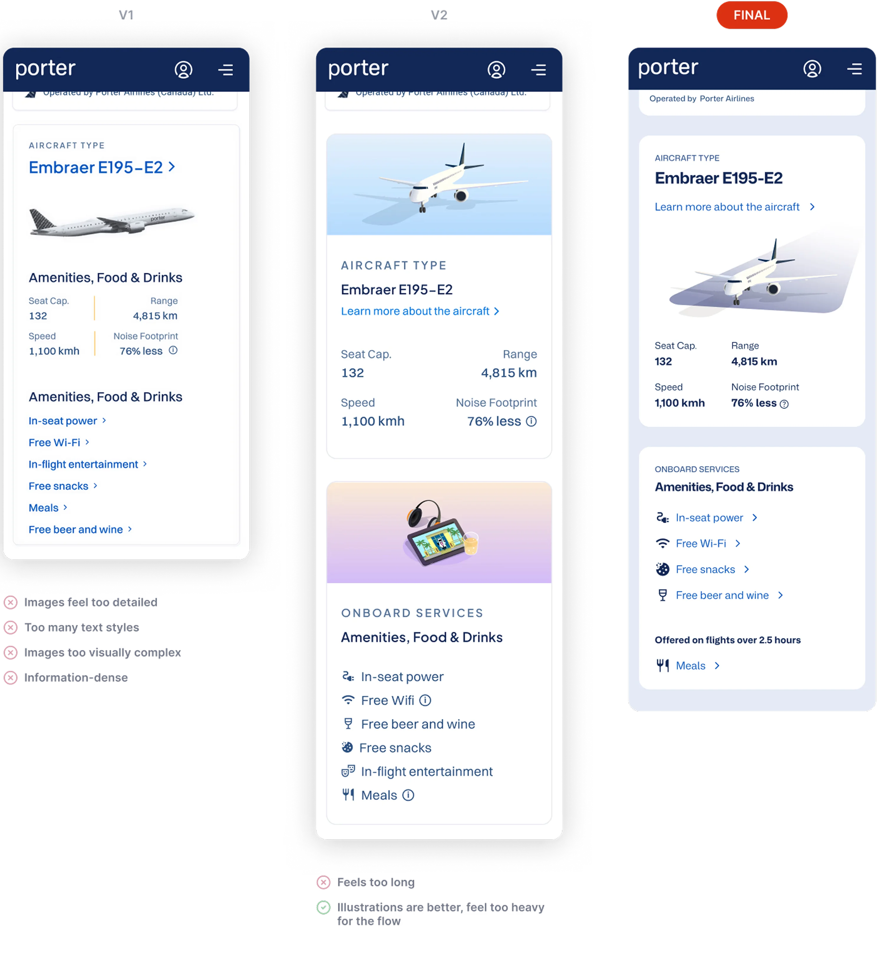
Aircraft type, configuration, and onboard services. Useful before boarding, memorable after.
Results
All five test participants were able to find and understand their flight status without assistance, including in diverted and cancelled scenarios.
All users also rated the redesign higher than the original on clarity and ease of use.
Designs produced 20% faster using the new design system.
What I’d do differently
Push for baseline call data before launch. Without it, the operational impact remains inferential rather than measurable. I would advocate for capturing baseline call deflection rates prior to launch, along with a 60–90 day post-launch measurement window—even if it means adjusting the launch timeline.
What I’d do differently
Push for baseline call data before launch. Without it, the operational impact remains inferential rather than measurable. I would advocate for capturing baseline call deflection rates prior to launch, along with a 60–90 day post-launch measurement window—even if it means adjusting the launch timeline.